

 White space, so named because of its common use in graphic design (which usually uses white paper), is essential in creating a design aesthetic that is clear, concise, and appealing to the viewer. But make no mistake about it—white space is not to be confused with blank space at all. In fact, white space isn’t even always white. It is, however, always empty, always clean, always in demand.
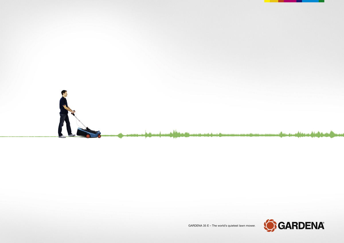
White space works to draw attention to the more complex elements on the page that it’s meant to contrast. The world of advertising has fully embraced the trend—we’re seeing it in print advertising, television commercials, and individual business correspondence. It’s appearing on banners, business cards, and is often used in custom poster printing, including advertising jewelry, restaurants, and sporting equipment.
This strategy of simplicity works for a variety of reasons. First, it allows a consumer the opportunity to immediately digest the product or text being presented to them. Often, especially in the case of television, the product name is not immediately presented to the audience. Instead, a viewer is faced with a simple product and allowed time to contemplate its complexities. I’m thinking specifically about an ad for “Wonderful Pistachios” that aired during the 2013 Super Bowl, in which singer Psy sings a version of “Gangnam Style” tailored to the pistachio. The commercial is set against a white background and features humans dressed as nuts in black leggings and tan and neon green shells. Psy’s outfit mirrors theirs, but includes a suit jacket instead of a shell. It isn’t until the end that the viewer is even presented with the product’s official packaging—and yet, we know.
We know because good companies assist the consumer in brand recognition. Often, this happens by way of strategic use of white space. In the mid 90’s, Hallmark launched a campaign designed to get people to flip over a greeting card to identify the brand. Consumers found a nearly centered black and white Hallmark logo surrounded by white space. The design was replicated in print advertisements and eventually requested as an ad design by magazines. The simplicity spoke to consumers and advertisers alike.
White space is so crucial because it forms a lasting impression in the mind of the viewer. In their simplicity, ads that utilize white space are more memorable to viewers. Ultimately, these individuals are presented with less material but leave a scenario with more information. Their attention has been focused on the most important details of a product—and the sleek, modern way in which they’ve been presented leaves a lasting impression.
Finally, the abundant use of white space in artwork creates a look that establishes an immediate sense of mood in an advertisement while minimizing printing costs. And, the more simplistic the design, the more timeless it becomes. Think about something as simple as a personalized birthday banner—given the use of white space, you can communicate a simple message in a meaningful and memorable way, a birthday banner that wishes Grandma a happy 70th and Junior a happy 5th.. And best of all? Everyone will keep their focus on Grandma, not your cluttered design.
Put your new found knowledge to the test. Go here and see if you can tell what makes it or breaks it for these designs.
About the Author:
Annie Harrington is a small business owner and freelance writer. In her free time she enjoys writing helpful articles so that other small business owners can positively impact their brand image. When she’s not writing she is either taking photos or designing custom banners with Vistaprint.